January 12, 2017
Alternate Covers – A Brand-Defining Process
January 12, 2017
Last May when I visited my publisher, Bethany House, in Minnesota, I had the incredible pleasure/delight of seeing the preliminary covers designed by Kirk DouPonce of DogEared Design. they had considered for Conspiracy of Silence (Tox Files #1). Interesting to me was the fact that these covers were almost *exactly* what I’d asked for and hoped for with this new series.
What’s even more interesting is that I’d already seen/released the cover for Conspiracy, so as my mind worked past the question, “Why didn’t they use these?” – I realized a few things:
- MERIT – Each cover I saw (posted below) was great, amazing even. One or two I’m a bit envious of admittedly. They all would’ve worked and been a good addition to my lineup.
- BRAND – The cover style I’ve come to be known with in recent years–in large part thanks to Kirk’s design genius–was not reflected (strongly) in these covers. Each one has great merit, but they are not “Ronie covers,” and that was fascinating to realize. I was so surprised at this, and “got” where my publisher was coming from.
- THRILL – I am absolutely content and pleased–no, THRILLED with the covers that BHP is using for The Tox Files. Next month (mark your calendars for February 7th!!), you’ll see the OHMYWORD! cover for Crown of Souls (Sept 2017). BTW: Rel Mollet saw it and forgot there was actually a story to go with it. Susan May Warren saw it and volunteered to be rescued by Tox anytime.
I’ve worked hard through the years to develop my brand, and that is readily identifiable in my plots (complex, compelling, intense), my writing style, and the covers themselves.
What do you think of these? I’ll number them, so you can comment below with ease–and VOTE to win a Tox Files mug and an autographed copy of CONSPIRACY OF SILENCE!! (Open to U.S. Readers only–sorry, but the shipping costs on a mug would be awful).

Alternate Cover #1
1.) Wow!! I hadn’t seen this until Randy B. BHP/BPG sent it to me yesterday. I’m super impressed with it–absolutely gorgeous. But I think I see why I never saw a mock-up. It’s probably the farthest from the RONIE KENDIG – Rapid-Fire Fiction brand. Also, it brings to mind a speculative story for some reason. That’s probably just me–maybe it’s the fonts and hues? It’s pretty awesome, though.

Alternate Cover #2
#2) LOVE the hues in this one. Though the hero’s face is nice, it doesn’ seem to work here. Overall, this is the closest to what I’d originally hoped for in a cover…and yet, I can see how it’s not a “Ronie” Cover.

Alternate Cover #3
3.) Okay, I can’t find anything that–to me–doesn’t work for the cover and story. Personally, I love gold/red hues in a cover. That and the “chilling” pale blue tones.

Alternate Cover #4
4.) Bam! There are the red/gold hues I love. But I the hero so front/center doesn’t really work for me. But I’m totally loving that ‘wave of fire’ behind the titling. And the gradation of color for The Tox Files. I also really like the font for my name better in this one. And yet, there’s something a little “commercial” about this cover, which feels ironic to say. Dunno.

Alternate Cover #5
5.) Okay, dudes. I LOVE LOVE LOVE the Jason Bourne feel to this cover. And yet…maybe that was what had the BHP team veer off, since the story is more paramilitary. But yeah. I’m in love. Haha. Note that the font of the title and my name are what translated into the final cover.

Alt Cover #6
6.) I really the more muted tones on this, but what I absolutely love on this one is the addition of the Codex on the bottom left.
I think that might be my only “disappointment” (perhaps too strong of a word) regarding my covers–The Warrior’s Seal, Conspiracy of Silence, and the soon-to-be-released Crown of Souls)–that there is no hint of the artifact that Wraith is out to recover.

Alternate Cover #7
7.) TAH-DAH!! ALMOST. haha. This is the final cover, but in a black/white alternative.
And to be fair – the final, perfect cover for
CONSPIRACY OF SILENCE!!

VOTE TO WIN!!
Latest Books
-
 Achilles
$12.99
Achilles
$12.99
-
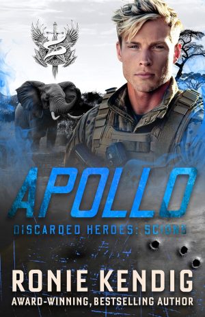 Apollo
$4.99
Apollo
$4.99
-
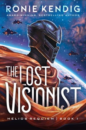 The Lost Visionist